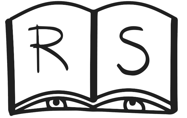


This small artist's book from The Language of Watching contains visual poems adapted from the "The Book of Birds," a 1932 National Geographic publication in which anthropomorphic captions accompany lush illustrations created to foster emotions for bird kind. At that time, birdwatching was still in its infancy—a hobby that had emerged from a conservationist movement to prevent birds from being hunted to extinction for their beautiful plumage. My aim with this book was to sever the captions from their images, and arrange them as a series of free-standing visual poems, to function independently as imagery. As former captions, these lines would have "narrated" an image, but without their host images, I found the text to be compelling on its own, containing a welcoming cadence that could be manipulated in meaning and rhythm through spacing, kerning and unusual compositions.
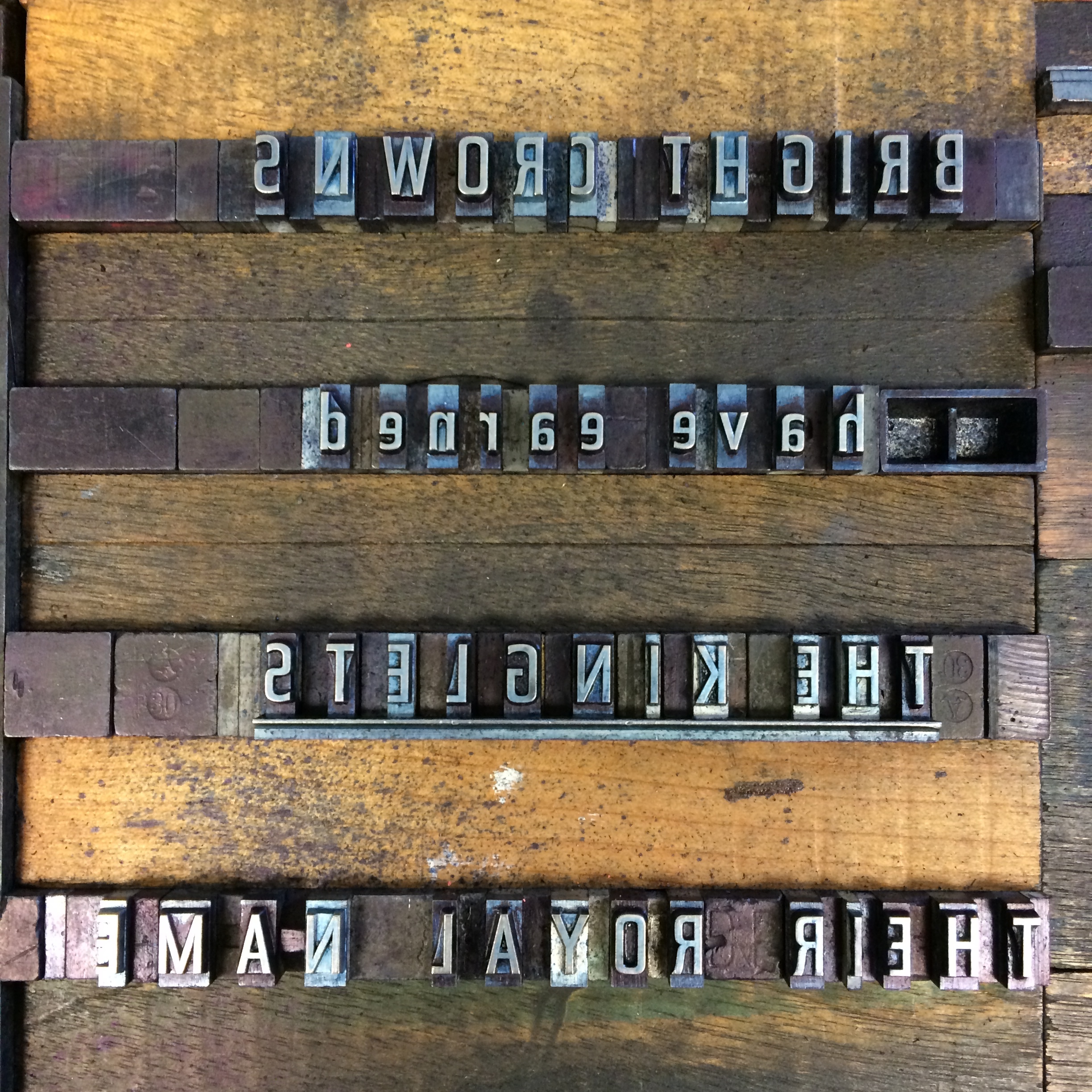
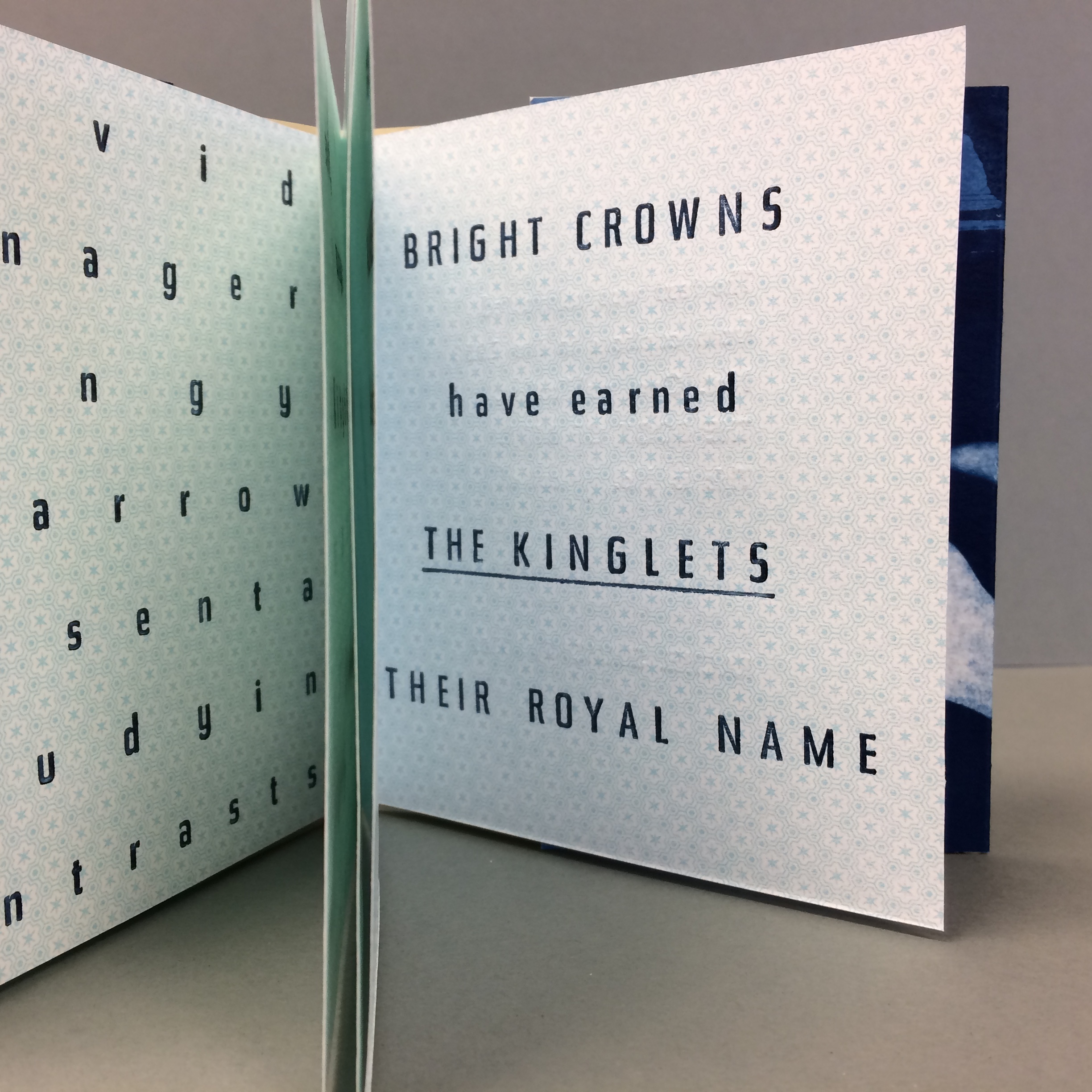
"Bright Crowns" was printed in the summer of 2016 using hand-set Futura type on both French and Arches papers with additional screen printing and cyanotype processes for the interior and covers. It is 5" x 4.5" closed. I used the Vandercook Universal I press at Rollins College. It is available in an edition of 5.
Cyanotype is a photographic process that uses a UV sensitive water-based chemical wash on paper to develop images.
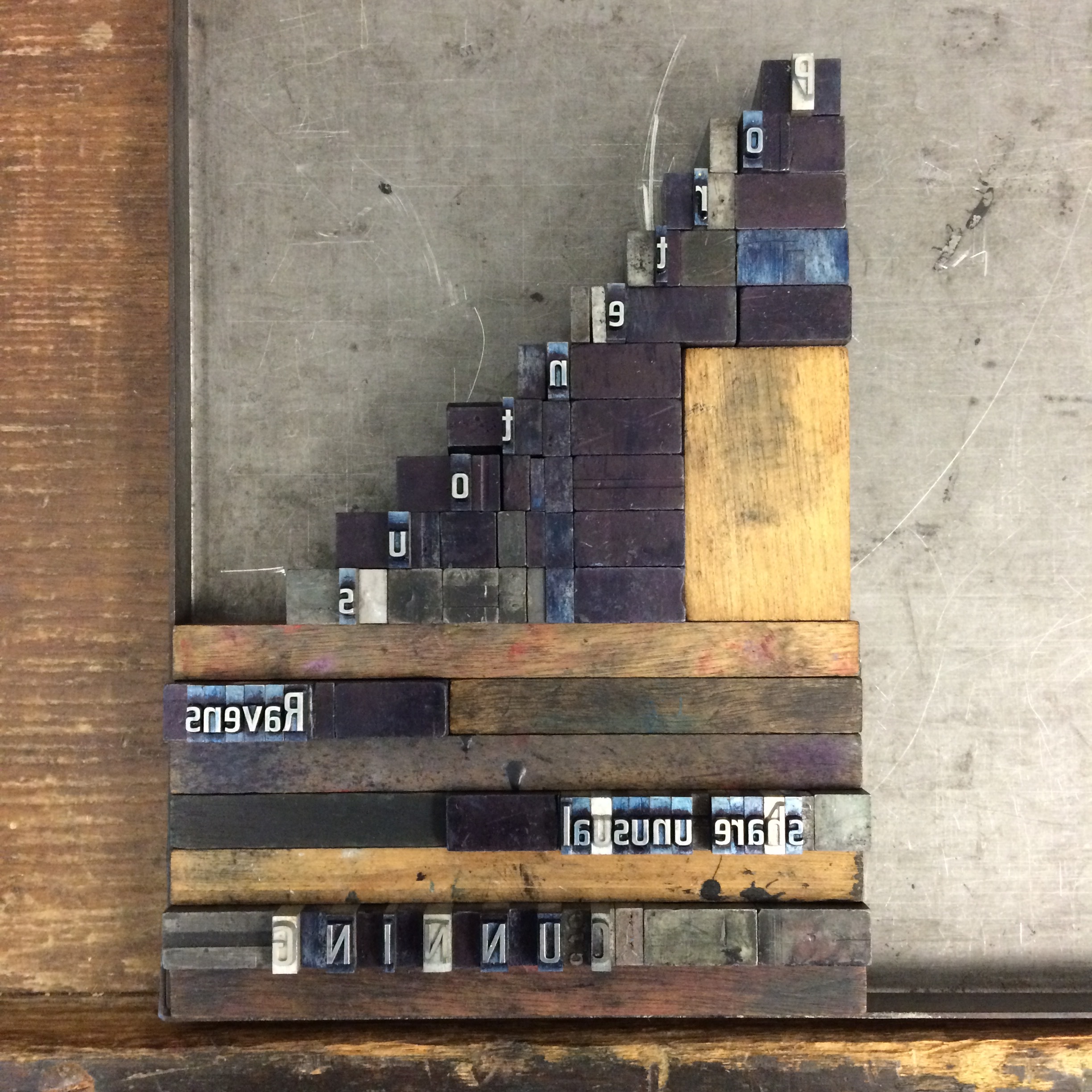
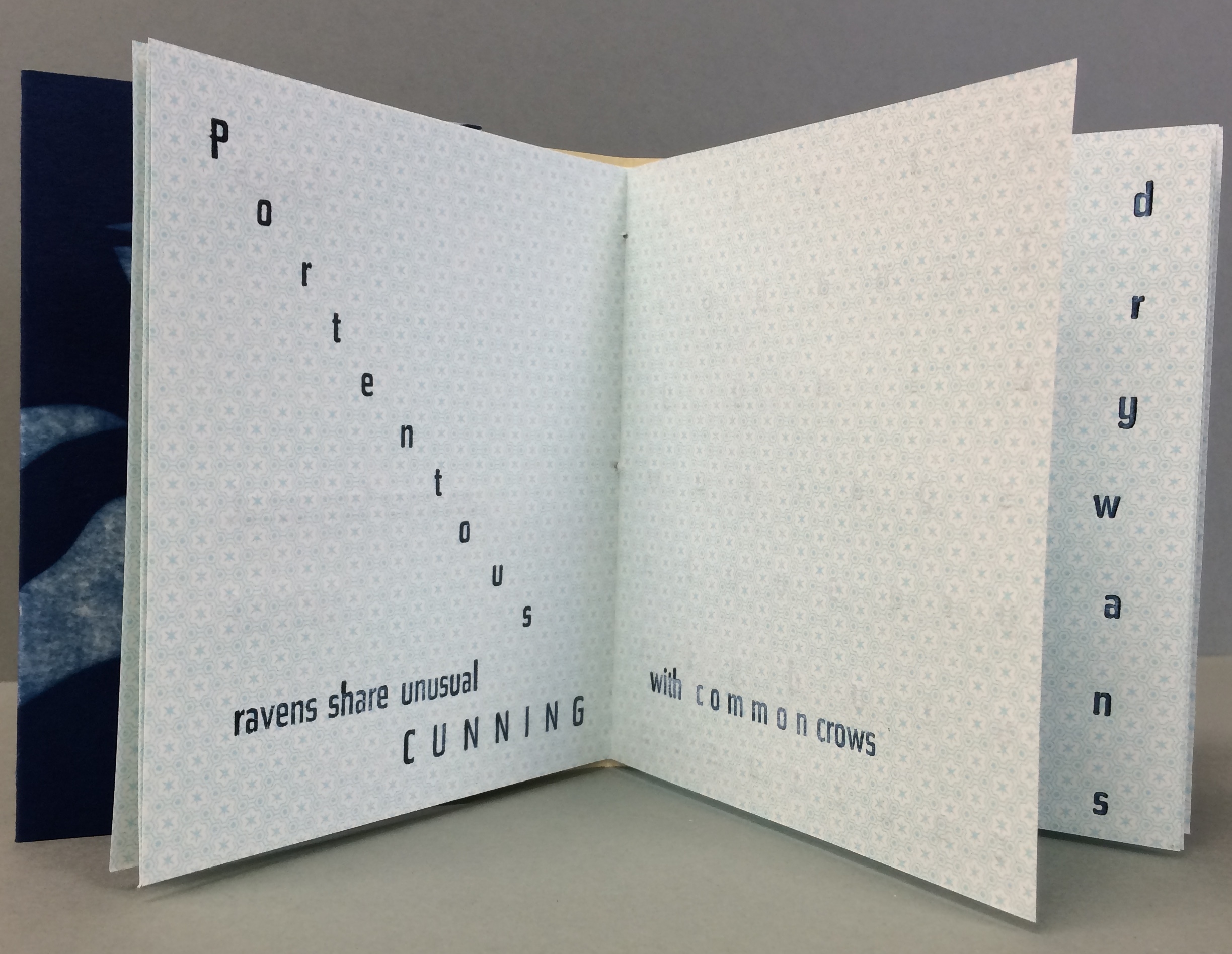
setting type in a staircase is a difficult but satisfying task
The typography for this spread was inspired by the weightiness of the word "portentous" which means "trying to seem important, serious or impressive." A steep staircase came to mind, so I set the type as such, descending down towards the fold, with all other text pushed below it.
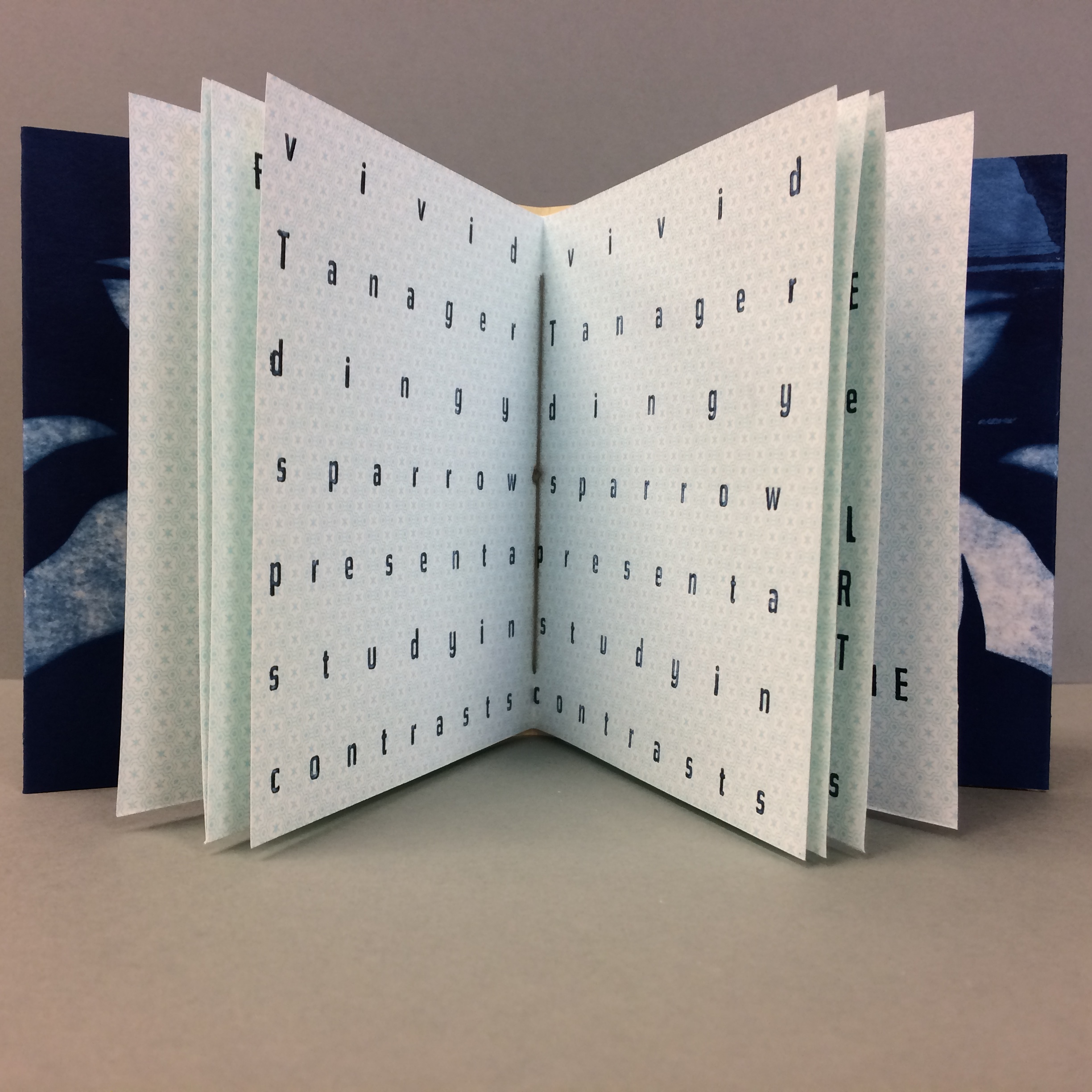
The experimental typography for this spread was meant to echo a vision chart. The text reads "vivid tanager, dingy sparrow, present a study in contrasts," but with such wide kerning, it is very difficult to see any visual contrast between the words themselves. Though the original function for this text was as captions for images, when separated from the images and reconfigured, the text becomes both visual and written information all in one.
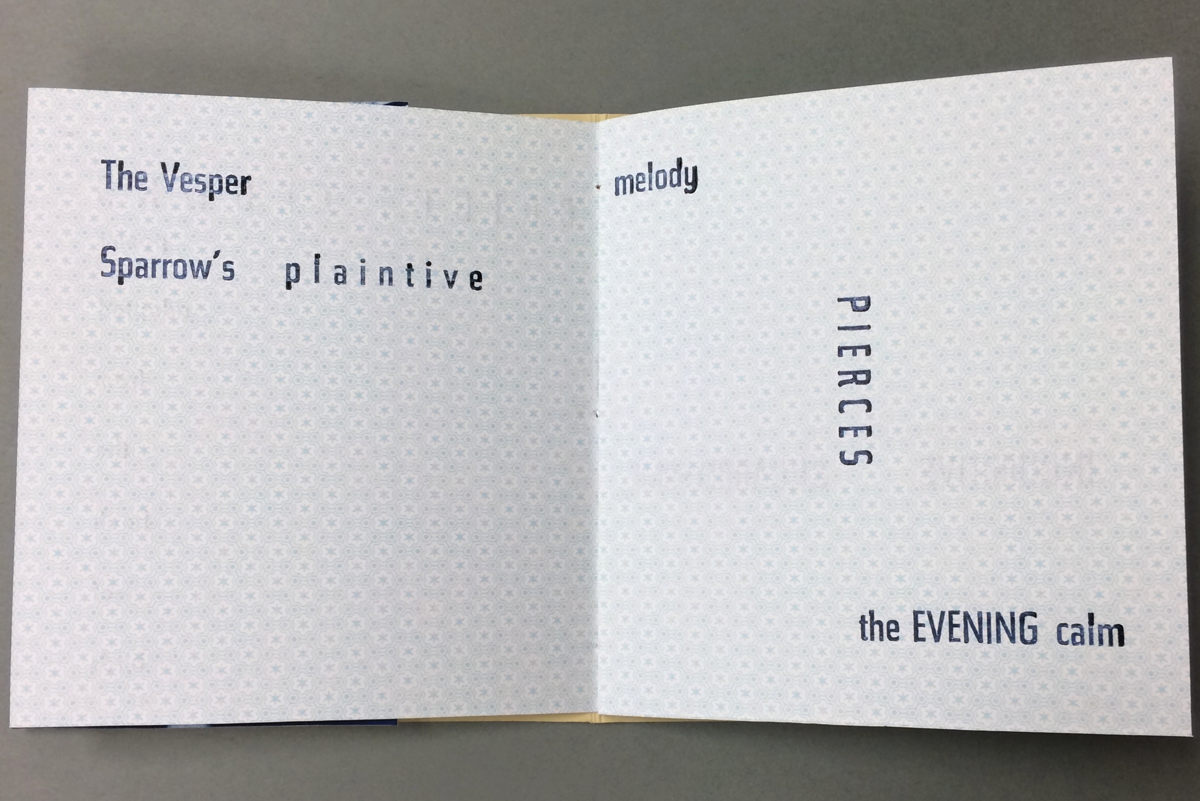
This poem deals directly with birdsong and the typography aims to visualize the dramatic changes that birdsong can take. When birdwatching, I often imagine birdsong as lines and shapes, with special emphasis on long or high notes which can help me remember it later. This spread reflects the way I might try to memorize a birdsong as a visual poem.